Product Designer
Vehicle Assistance App
ITZAM-DEV

Workflows, Sitemaps, Wireframes, Developers Coordination.
Today, most of the insurance companies in Ecuador do not provide easy ways of requesting vehicle assistance or to report claims for its insurance holders.
1. Identifying the problem
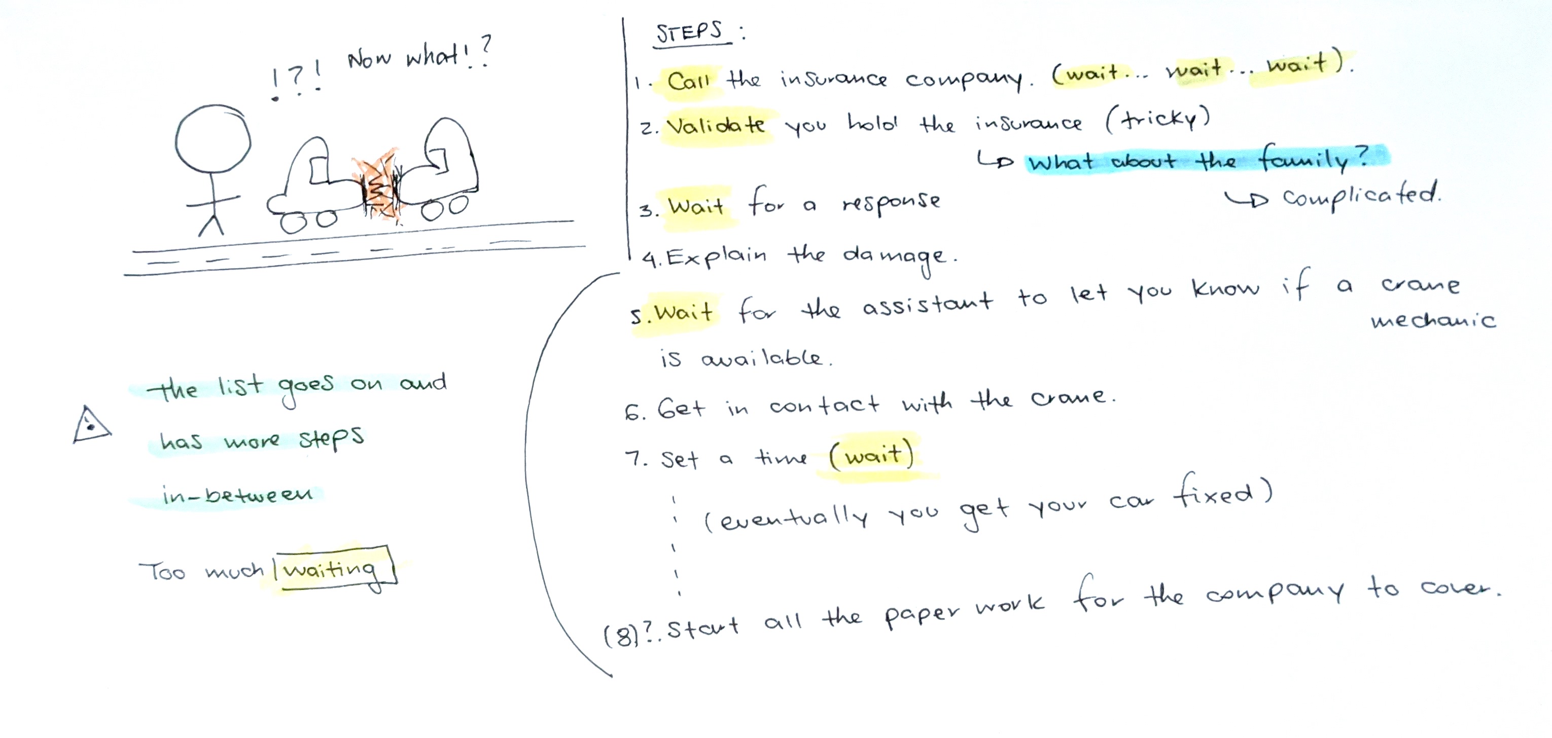
When an insurance holder has an accident or has a problem with his/her car the amount of time it takes for them to contact their broker or assitant is too long and complicated. Most of the times they have just minor inconveniences that can be fixed in a short period of time without paper work or tricky and confusing validations. This can be achieved by implementing an app that eases this process and reduces time.

Right now, one of the main problems is that the user has to follow too many steps in order to get help and the first and only starting point for them to cantact their insurance company is through a call where they are asked questions that sometimes they can not answer because of the stress of the moment or because they are not the direct holders of the insurance (i.e: sons).
2. Identifying the people involved (users)
The app will be used by the insurance holders and their direct family.
Wants an app that will make requesting help and reporting claims easier.
Specific features:
Register every assistance or claim from each member of the family.
Want an app that will make requesting help easier.
Specific features:
Easy validation.
Easy and fast to use.
4. Organizing the features
To make the process fluid, the user will only have to check on the data he/she is being asked through the app in order to get fast mechanical assistance. For bigger accidents or issues, the process requires more steps to cover all the insurance company laws.
5. Creating the app
With the map of the features in mind I satarted creating the wireframes of the platform in figma. It was an iterative process where I considered different possible layouts for the platform and I also implemented different features that can be of great use when using the app.
For exampe: I added the chance for the user to upload pictures of the parts of the car that were damaged both for the interior and the exterior of the car.
And I also added features such as:
As you can see, my role during this project did not involve designing the UI of the app but rather organizing the features and interactions of it. Nicolás, my teammate was the one in charge of it. And all of us, together with the development team came up with a fully functional app that right now, is being used by the insurance holders.
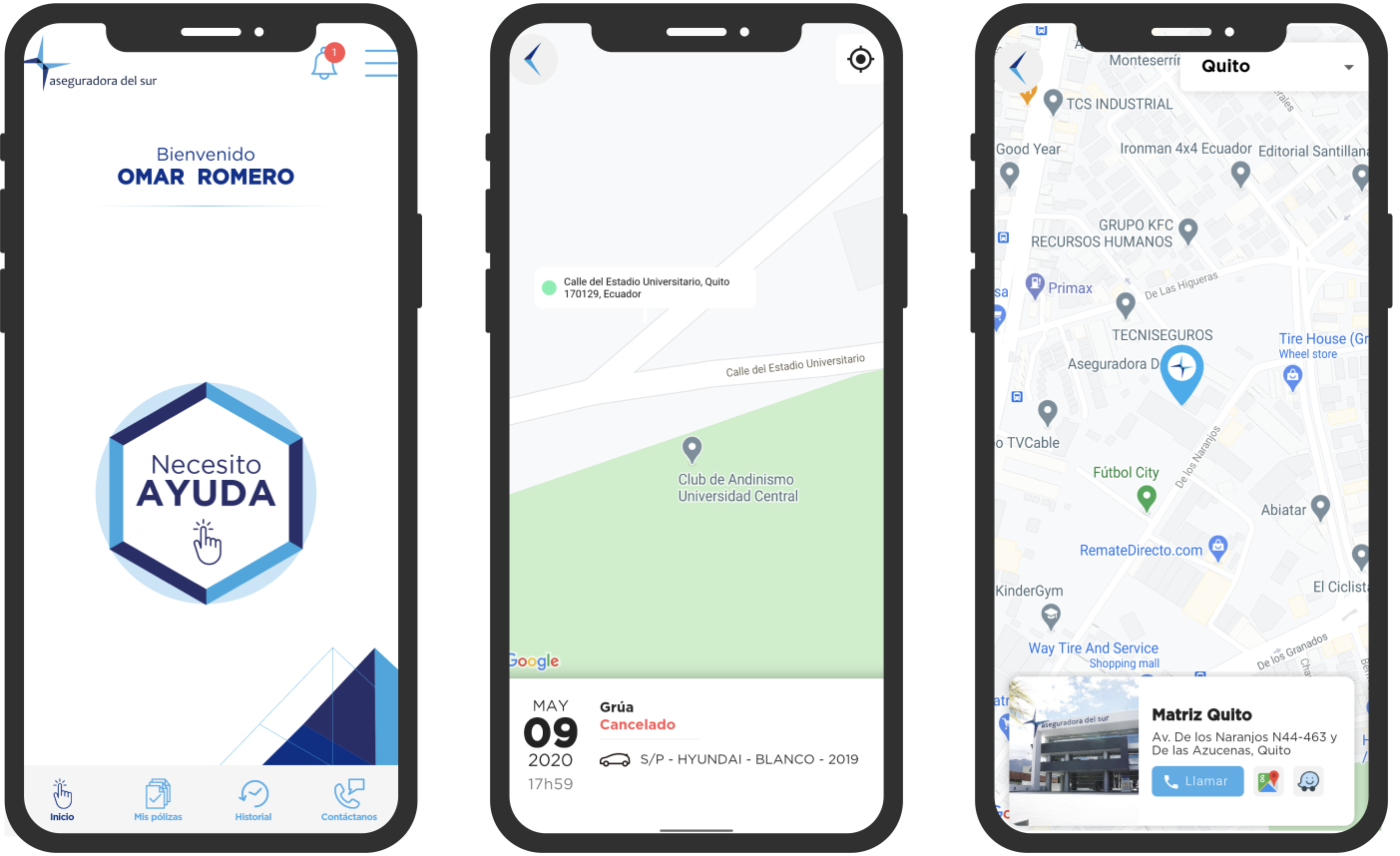
The final app looks like this. We are still in the fist phase of the app as it will have other features that the company requires.